A fresh look for an updated brand, mobile first thinking brings success to a popular lifestyle website
- Strategy
- UX&UI Design
- Development
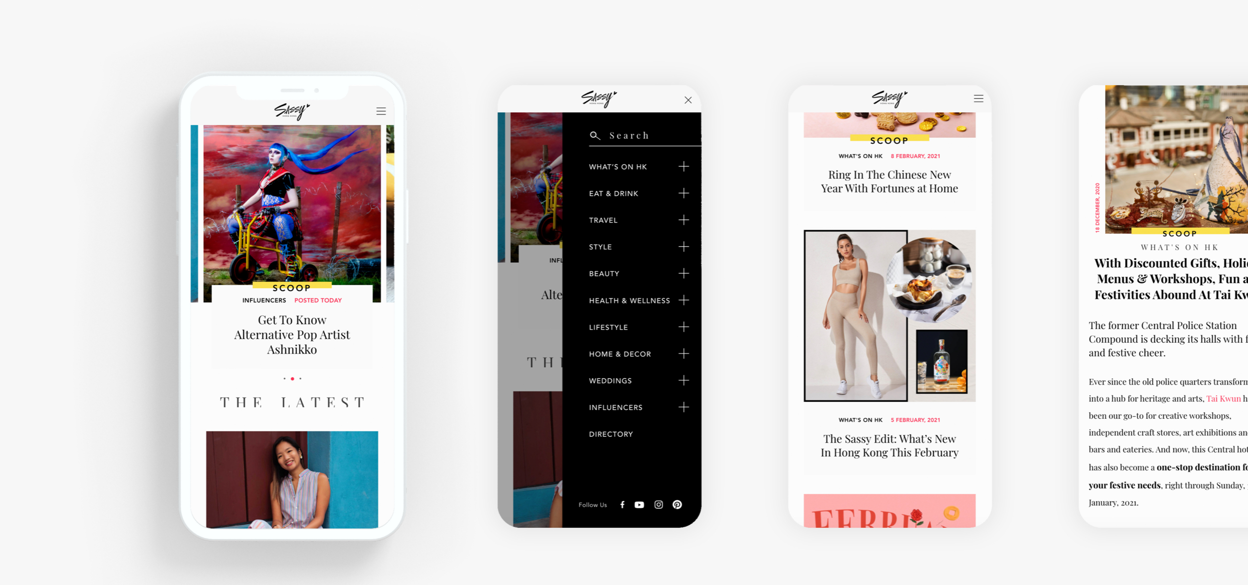
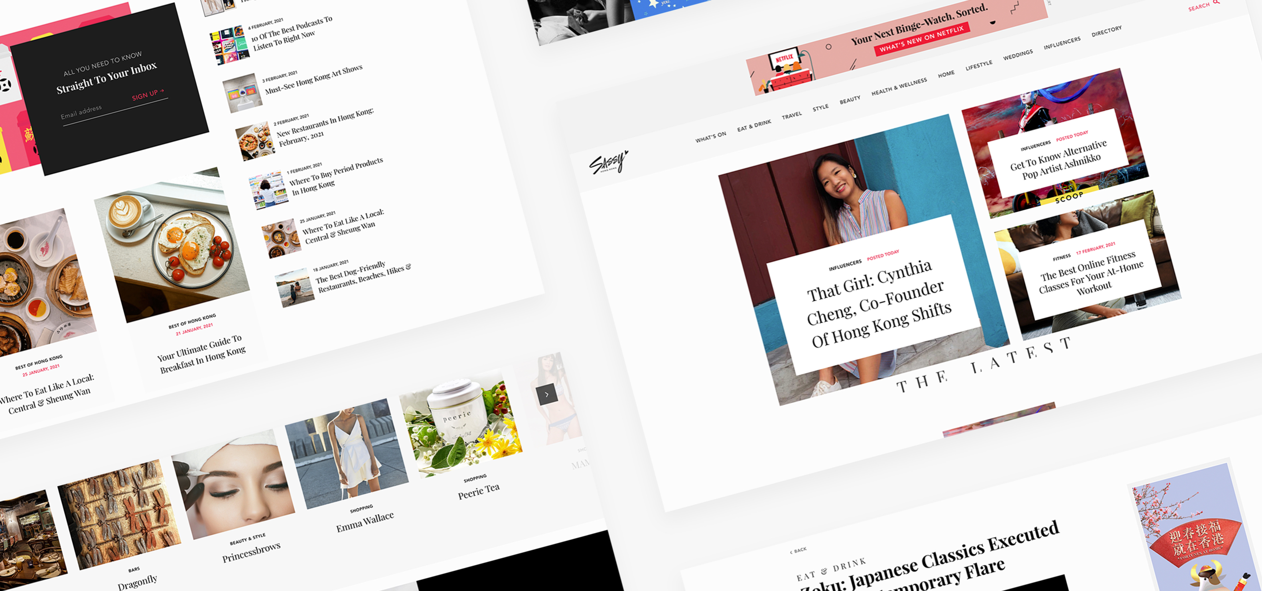
After the successful revamp of the Sassy Mama websites, Sassy Media Group tasked us with giving a new look to their key brand Sassy Hong Kong. It has just gone through a rebrand, with a much more eye-catching colour scheme. We were tasked with improving the mobile experience and make the entire site more dynamic and more inline with the experience that users were getting on the Sassy Mama platform.
- Client
- Sassy Media Group
- What we did
- Strategy, UX&UI Design, Development
- Launched
- October 2018
The results
An award winning website with a greatly improved mobile experience, with a unique look and feel that suits the brand's new visual identity. Cleverly placed ads that are always visible but never in the way. Continuing the trend of setting a high standard of what a modern lifestyle website should look like.

Rush Hour Digital won a
Silver W3 Award 2020
on Sassy Hong Kong

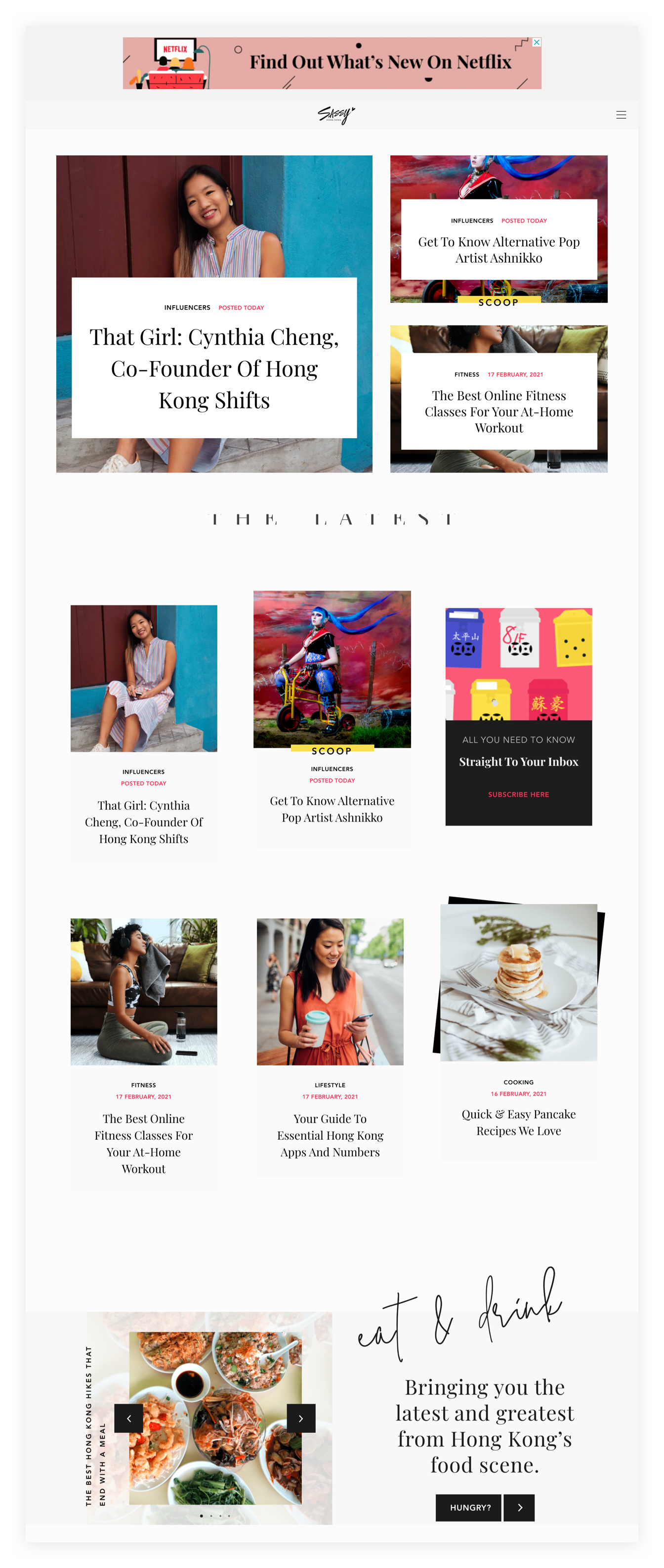
Lifestyle at a glance
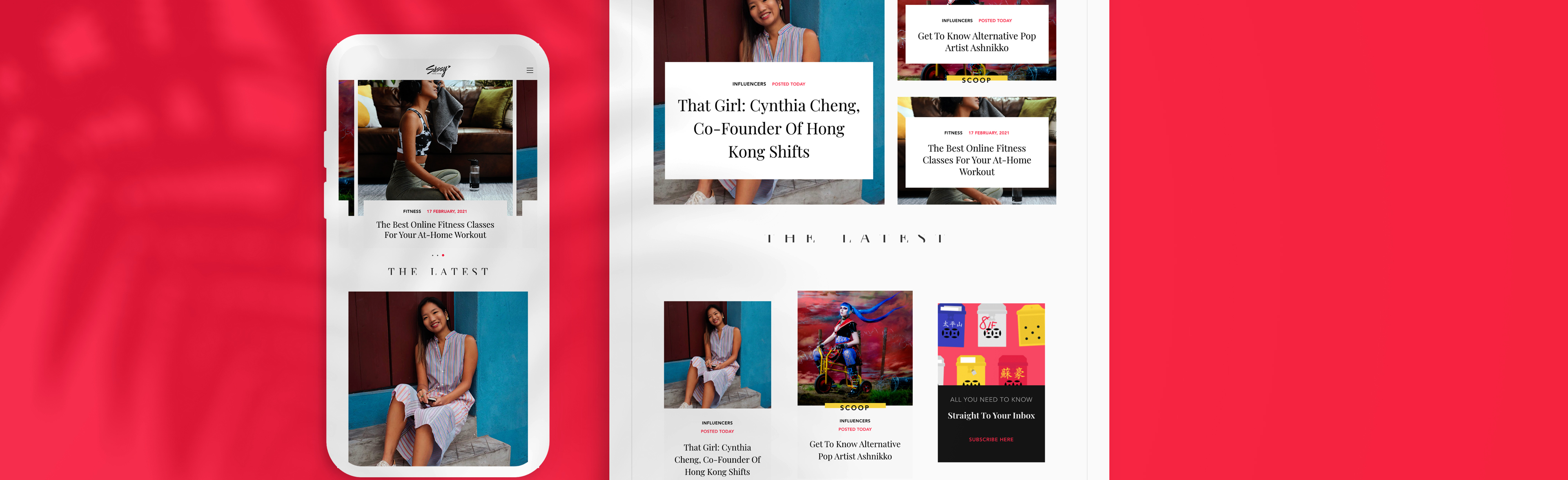
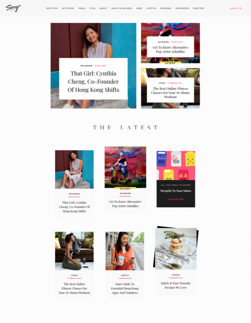
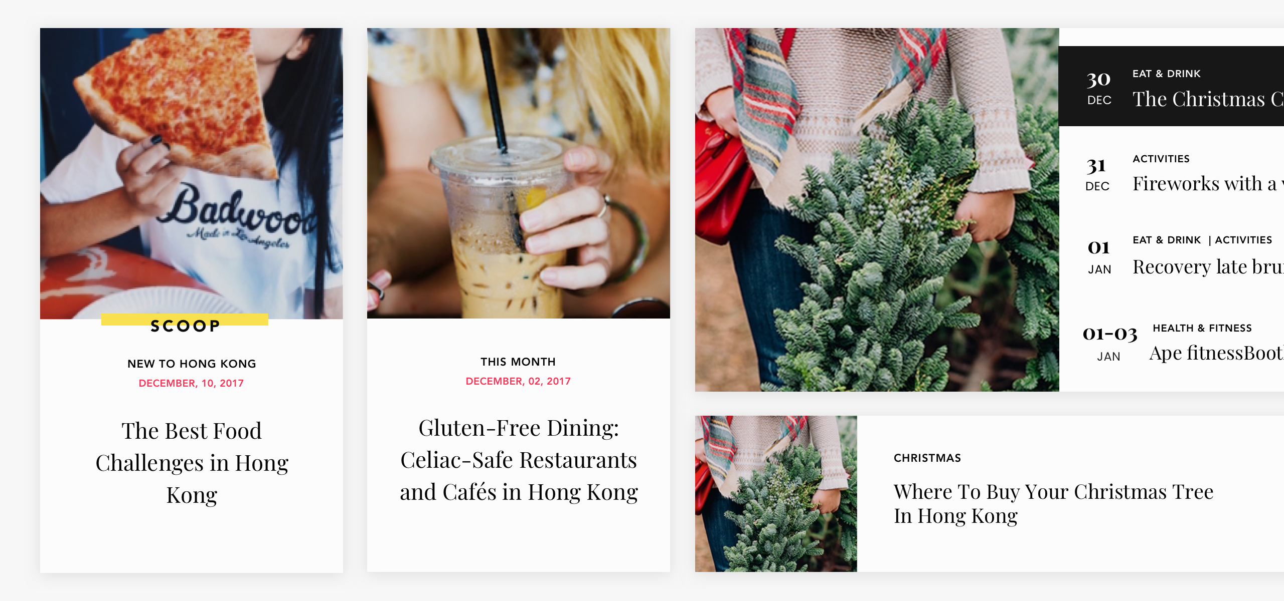
Serif and calligraphy type were used to support the overall branding scheme. We used colour to add highlights giving the site making the site feel more energetic and dynamic. We used clean imagery and layout to make it user friendly and won't get in the way of content consumption.
Strategy
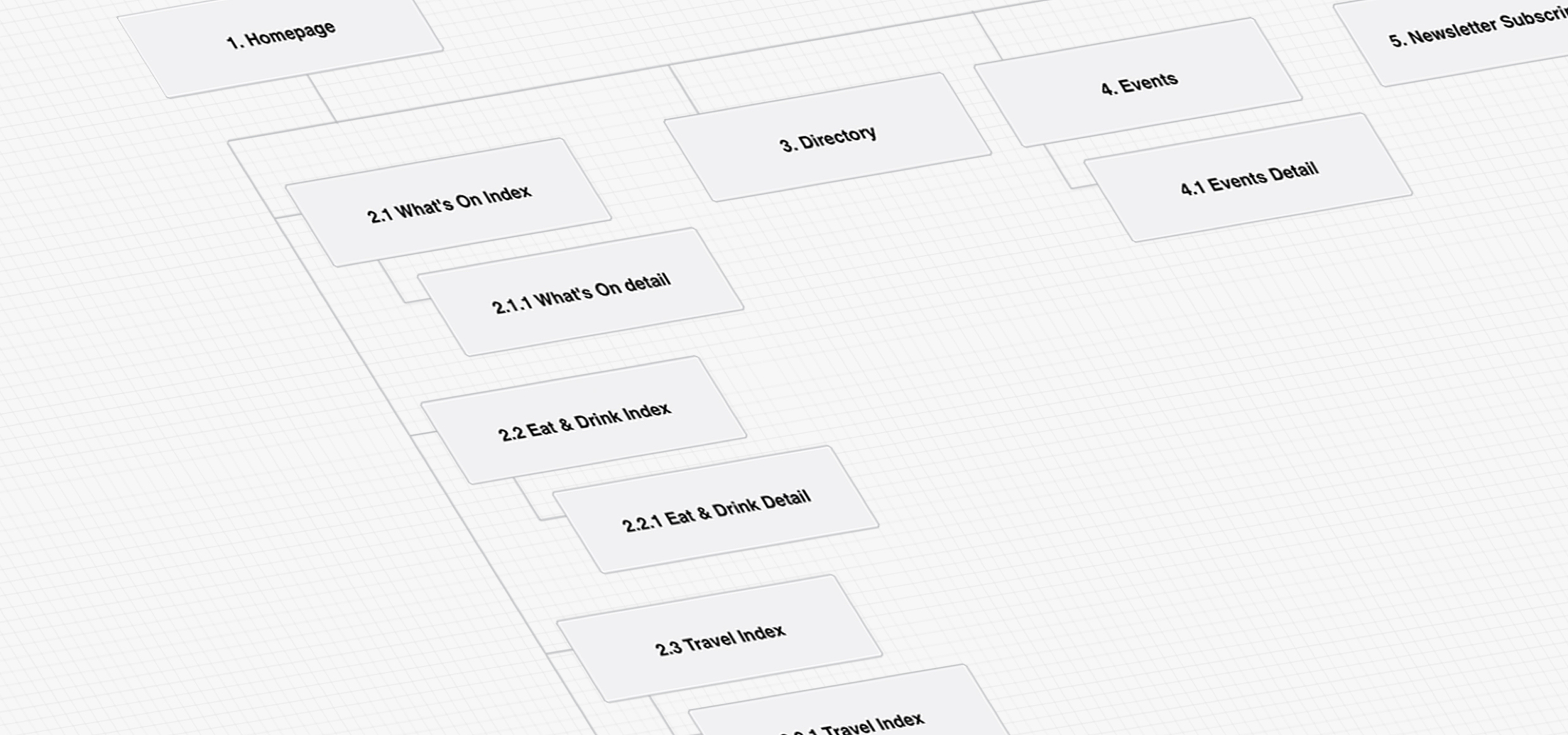
It was key to make the huge library of content as easy to find as possible so all of the articles are carefully categorised and sorted by themes or series. We also laid out the homepage in such a way that it is easy for a user to have an overview of the type of content that is available on the site at a glance. Given the importance of ad, these are all carefully placed on each template, so that they grab the users' attention without distracting the user from the articles. It is a balancing act all the way.
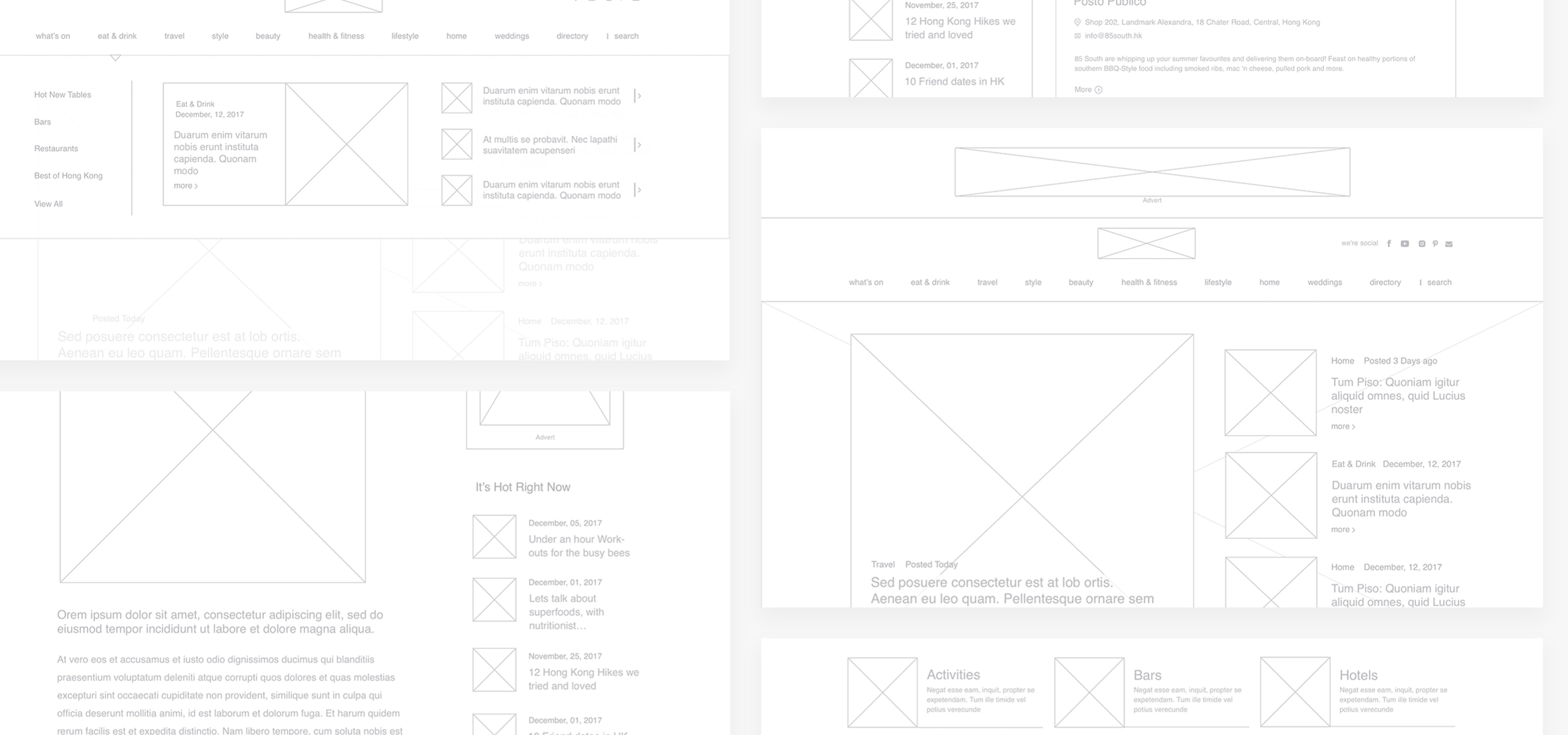
Design
Serif and calligraphy type were used to support the overall branding scheme. We used colour to add highlights giving the site making the site feel more energetic and dynamic. We used clean imagery and layout to make it user friendly and won't get in the way of content consumption.
Technology
The client has been using WordPress for a number of years. They are happy with its user-friendly backend interface. Since WordPress is very much designed for blog-style content distribution, we didn't see the need to change. However, when we revamped the site, we rebuilt a lot of the features in-house that were previously handled by plugins to elevate the security of the platform and decrease the chance of conflicts between a long list of plugins.