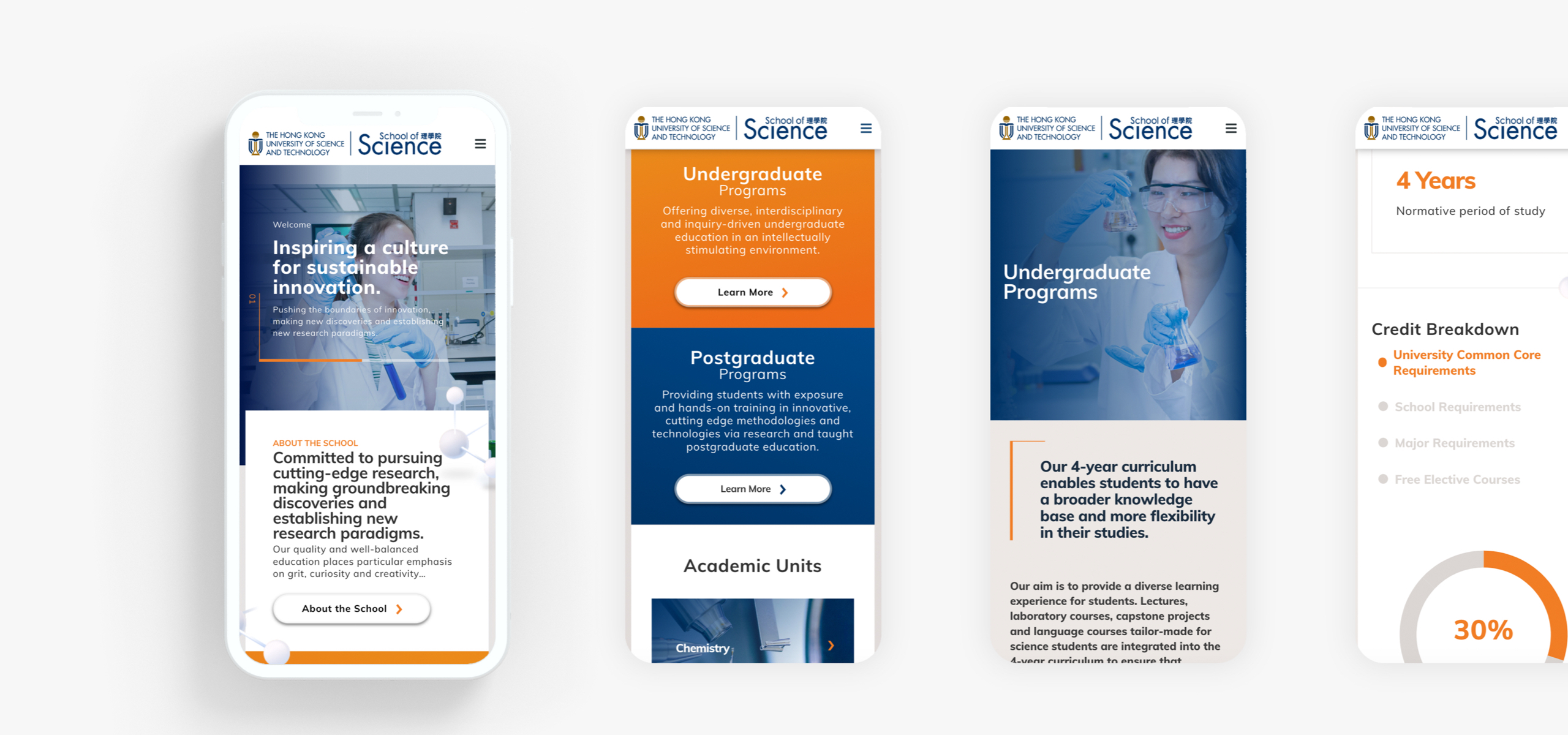
The School of Science of HKUST requested a tender from us to revamp the department's website, using their in-house Drupal distribution and integrate their 'People API' to handle the large directory of faculty members and staff.
- Client
- HKUST
- What we did
- Strategy, UX&UI Design, Development, Integration
- Launched
- October 2020
The results
A modern and easy to use website that caters for their staff, students and prospective students. The Information Architecture of the site was rebuilt from the ground up, prioritising a huge library of content and information.
3360+
140+

A vibrant & energetic look and feel
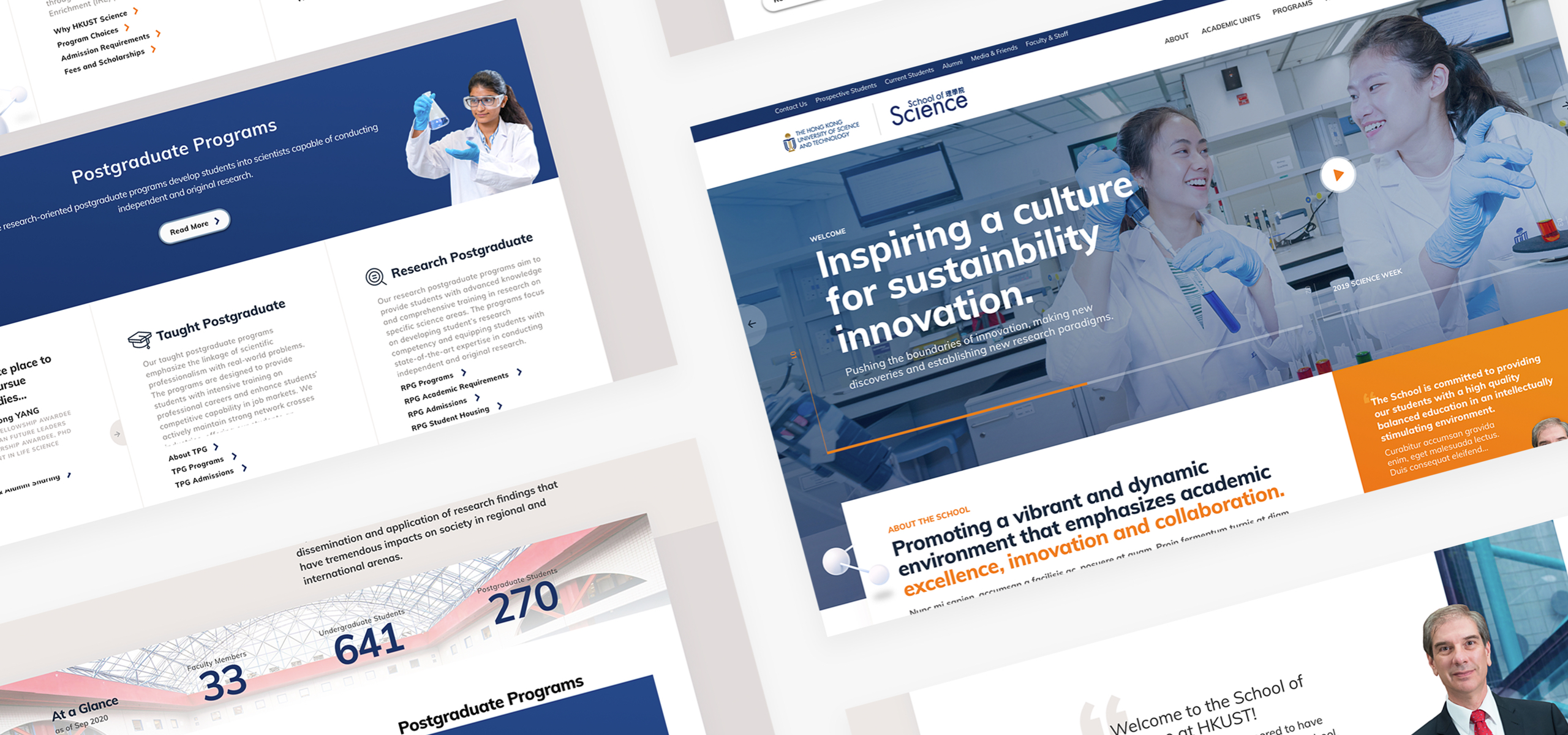
One of our focus was to allow the new website to stand out from its competitors. We did this by offering a much cleaner and bright UI with a lot of images of students and faculty members to give it a more approachable vibe.
Strategy
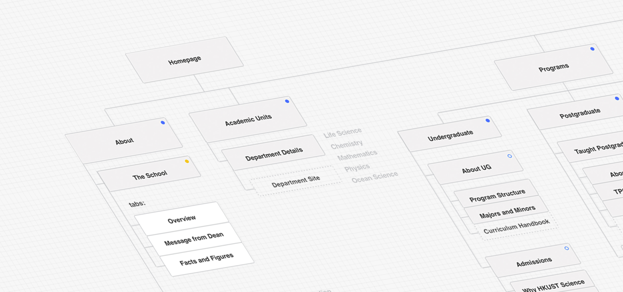
Similar to previous encounters with other websites in the education sector, Information Architecture is always a top priority as it makes the biggest impact. These websites have to give top-level information from admissions policies to extremely detailed information like curriculum handbooks and information on specific modules.
We took our time and worked closely with the stakeholders to really understand the ins and outs of the department so that we can in turn plan out a comprehensive sitemap where each piece of content fit in. We made sure that when it came to broader topics, users are always engaged to interact with the site as they go more in-depth. An example would be the Research section. It is a key driver for the School of Science, their published research can easily be found across the site.
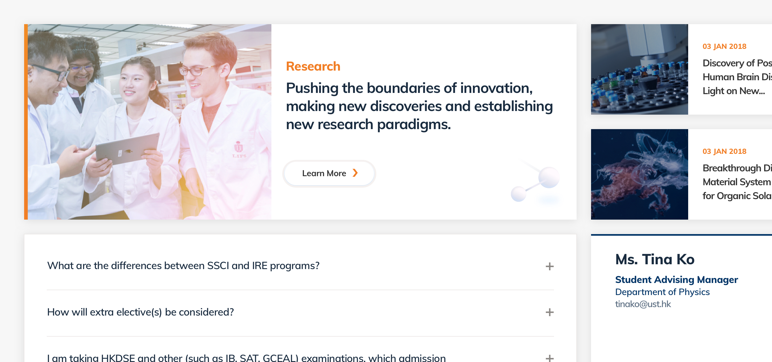
The site also offers features such as FAQ to aid users in finding answers to commonly asked questions in a timely manner.
Design
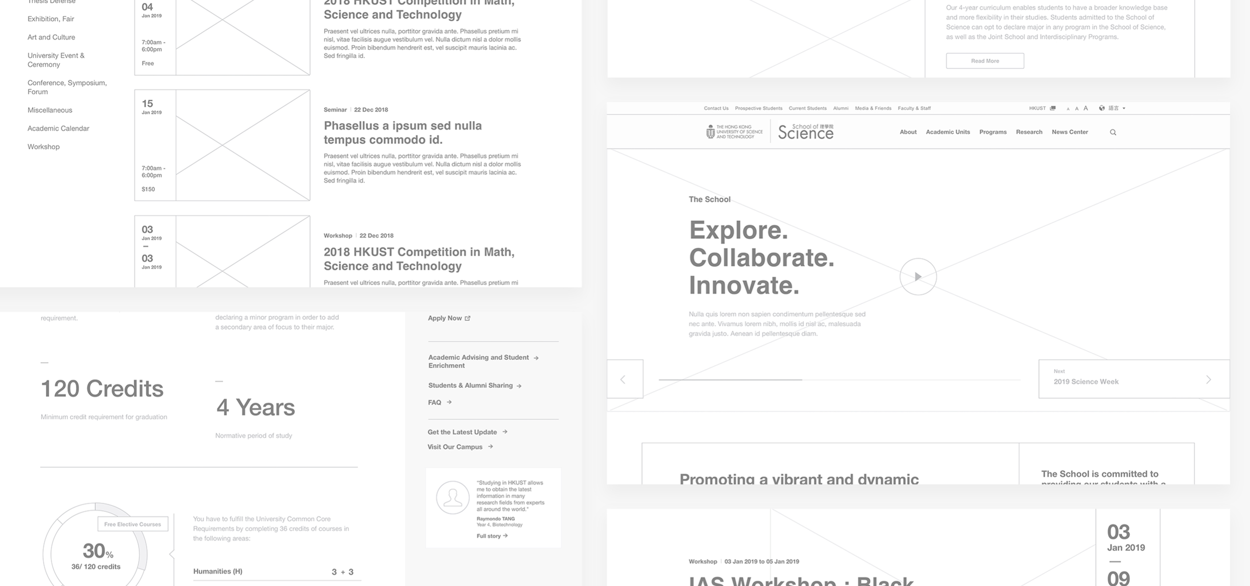
The design features a crisp contrast of blue and orange evenly distributed against white backgrounds for a softer approach. The site also holds quite a number of images. To ensure this doesn't clash with the overall design of the website, we carefully gave each image an overlay that has a subtle gradient strategically positioned to feature details whether it's the subject in the image or the content.
Technology
The site is built on top of their in-house Drupal distribution, which meant we had to follow certain guidelines and methodology when we were developing the product. Faculty member information is also integrated with their 'People API' centralising data management which in turn makes it easy for the internal team to handle the site.
