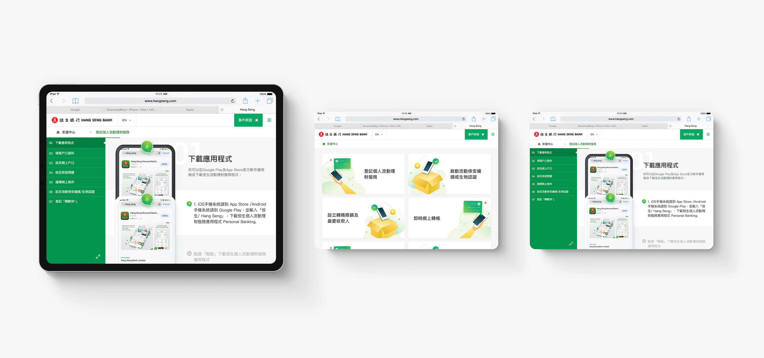
Hang Seng came to us to devise, prototype, design and develop an iPad-optimised online tool. The intention was to improve customer experience by effectively promoting and encouraging the use of Hang Seng’s mobile banking app.
- Client
- Hang Seng
- What we did
- Strategy, UX&UI Design, Development, Mobile App
- Launched
- June 2019
The results
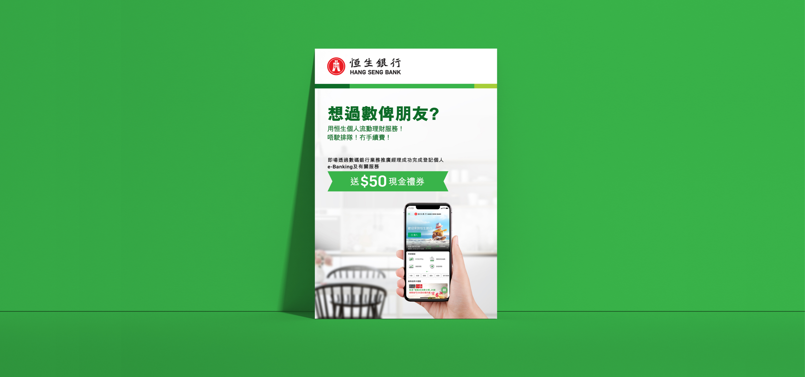
An intuitive tool launched in ten weeks from project kick-off to delivery, including marketing collaterals. The client was quite pleased with the end product as well as the quick turnaround time.
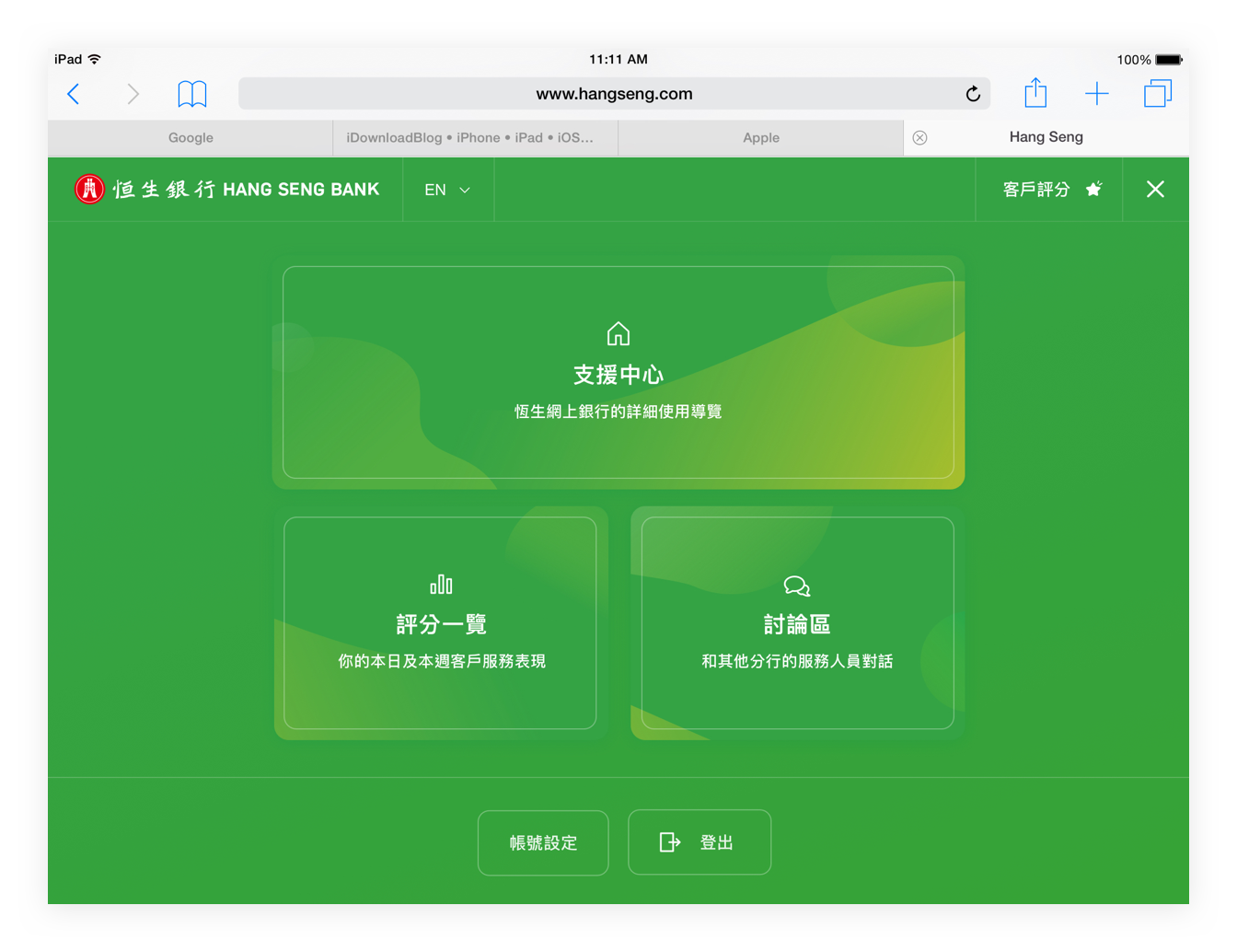
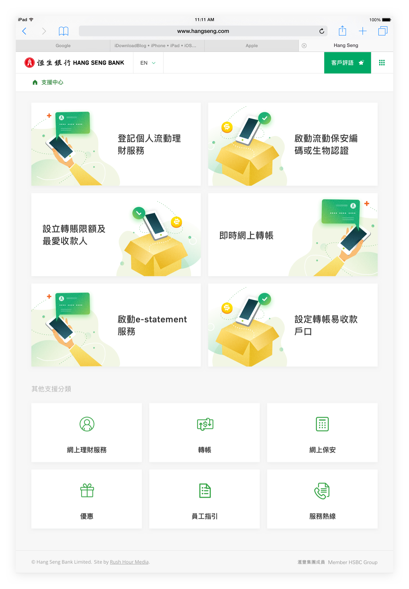
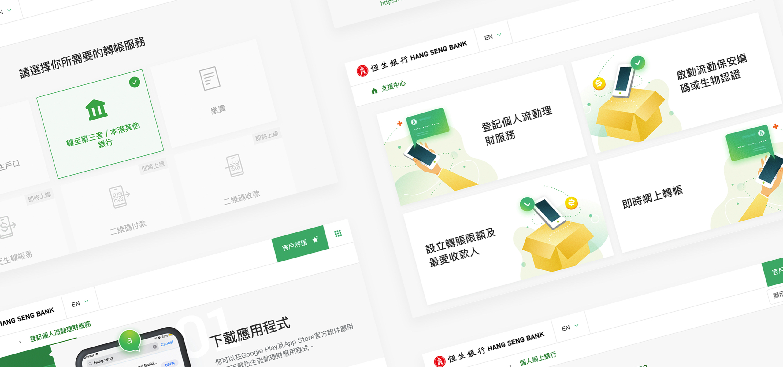
Intuitive and graphic-rich interface
We created a platform for Client Advocates to show Hang Seng clients visiting the bank to explore and navigate their way around the mobile banking app. Rather than using content, we crafted graphics to go with each step for a better user experience. The tool also includes a short survey for clients to rate the performance of advocates and a few other metrics accessible on the admin dashboard.
Design
Creating an iPad-focused product gave us the right constraints to make the right decisions on creativity and innovation. By utilising Hang Seng’s established brand, we were able to create a graphics and image-driven interface that were assembled with the intention of simplifying the content to deliver the right message.






Technology
The tool is built as a standard Drupal project. What was exciting was the device-specific optimisation requirement. Our team is always looking forward to challenging projects where our skills are further developed and tested.
