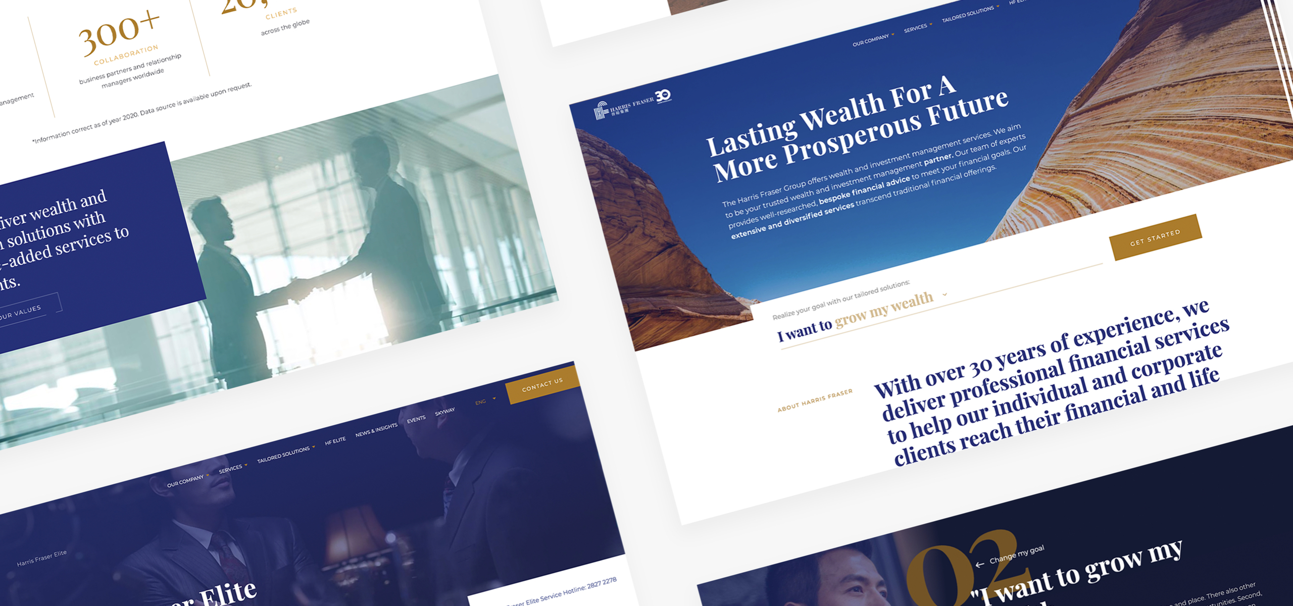
The main challenge in rebuilding the Harris Fraser website was to take a full, comprehensive account of the content and have an efficient content structure strategy around it. Apart from this, the website also needed a fresh look that made it approachable to existing and potential clients alike.
- Client
- Harris Fraser
- What we did
- Strategy, UX&UI Design, Development, Integration
- Launched
- September 2019
The results
An award-winning site with a comprehensible yet easy to manage information architecture paired with a bold, fresh look. Anyone can now come to the site and either find what they’re looking for or understand what they’ve been needing all along.
The client understood the inner workings of the job and this became valuable in accomplishing our project goals.

Rush Hour Digital won a
Silver W3 Award 2020 on
Harris Fraser


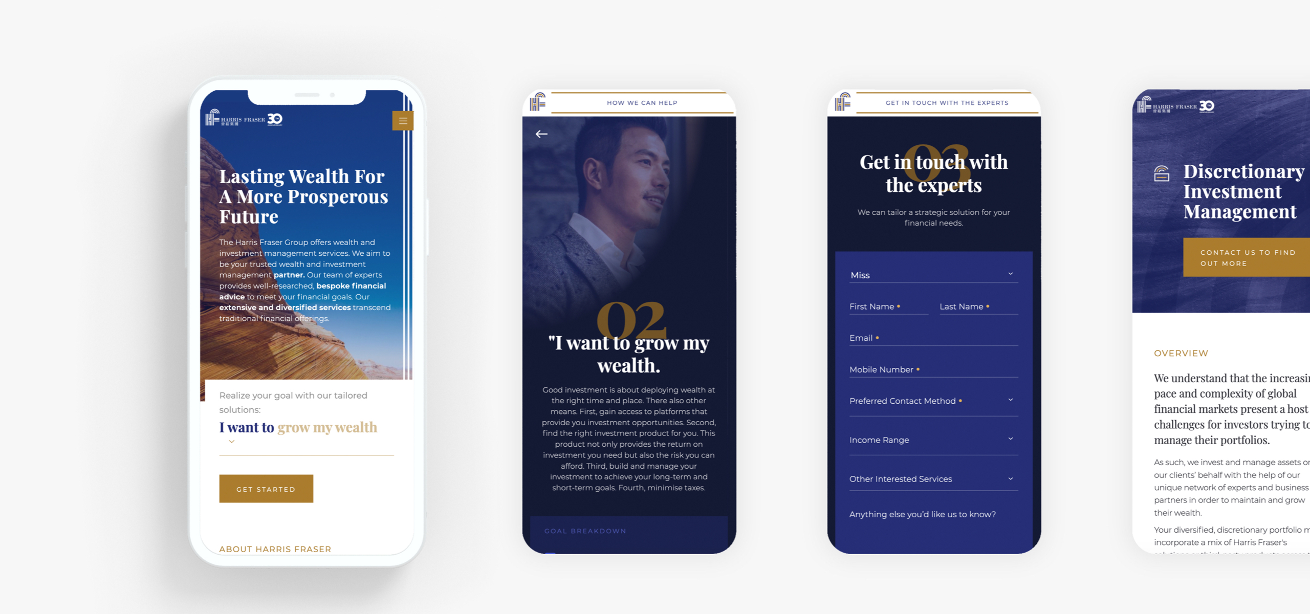
A fresh look with an added tool for a customised user experience
The new website includes a lead generation form where potential clients fill in the specifics of their needs. This equips the Sales Team at Harris Fraser to provide clients with a customised experience.
Design
Our UX/UI team got to work first and foremost on the User Experience of the new site. This meant gaining a good understanding of the content and how they were interrelated. Next was to pair this with a bold user interface featuring a distinguished content hierarchy and rich colours that was well-received both internally and externally.

Technology
As the site required a robust structure, we built Harris Fraser on Drupal. This allowed for the content-heavy site to be updated and managed easily.


