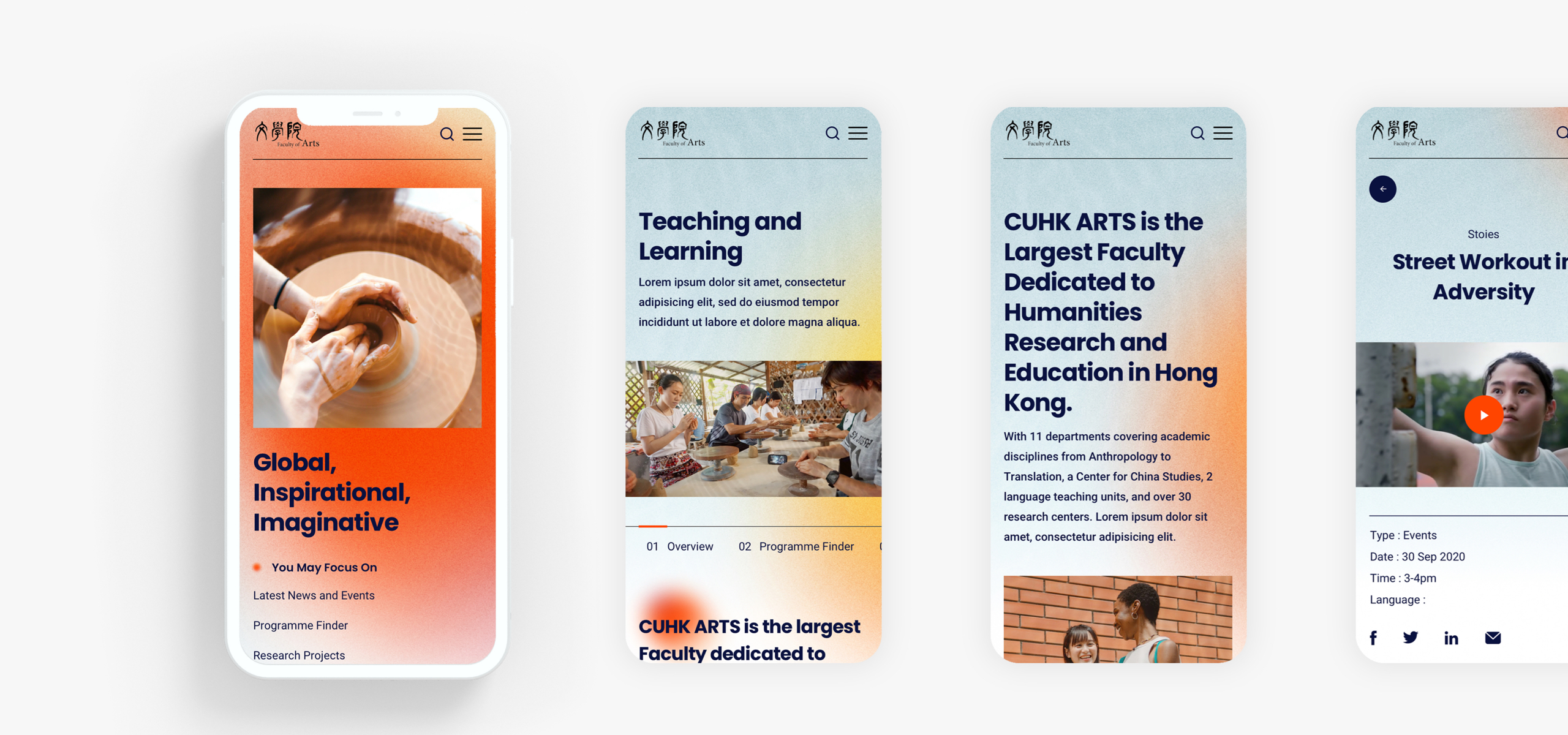
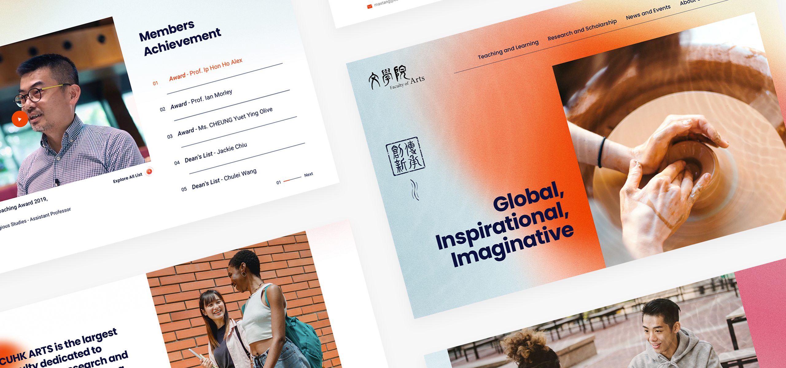
The faculty of Arts CUHK is the intellectual home for many world-renowned scholars, especially in the study of Chinese thought and culture and has been pivotal to CUHK’s commitment towards integrating Chinese and Western traditions, bilingual education and innovative research.
Their website, however, didn’t reflect this dynamic culture. Aesthetically it didn’t do them justice. There was no structure to the content. It amplified confusion rather than coherency.
The site needed to highlight the opportunities available to students and scholars at CUHK, so we designed a website to do just that.
- Client
- CUHK
- What we did
- Strategy, UX&UI Design, Development
- Launched
- August 2021
The process
Once we had defined the key jobs to be done for our target users for the website, we wasted no time in running a heuristic evaluation, and content inventory of the existing website, together with a kick off workshop with the team at CUHK. This was to make sure we were all aligned on the goals for the project.
After coming up with some initial design directions for the aesthetic and the user flows, we translated all these design decisions into wireframes in order to quickly visualise the content hierarchy and flow between the different pages.
We based these initial ideas on a content prioritisation exercise we conducted with key stakeholders to make sure that we were devoting enough space to the most important features that CUHK users required.

The Design
The wireframes became the foundation we built upon when we created a clickable prototype to test with CUHK’s target users and receive feedback on the initial design for the website. This enabled us to get useful feedback and iterate quickly so we would have more time on development and content planning.
When we started working on the UI, we set 3 principles to guide our design. The first was to be more humanistic and centre the site around the people. The second was to provide guidance and suggestions to assist users in finding what they need. Lastly, don’t overload users by providing too much information, but instead give them a taste for the content with the option to then delve deeper.
The team thoroughly enjoyed partnering with CUHK for this project and are proud of the outcome.
Development
We wanted to create an accessible site for all, therefore we created a custom module to translate the language between Traditional Chinese and Simplified Chinese.
To enhance the experience our developers worked closely with the designers to create a range of different animations and page transitions to help bring the site to life using meaningful motion. This was a key part of the creative brief in which we wanted to over deliver on.

